Version 0.0.10
This update focuses primarily on GUI improvements, and some minor bug fixes. The simulation has not been changed as of the latest update.
2 Major GUI additions have been made: The map filter selection, and the tile data visualization.
Map filter selection
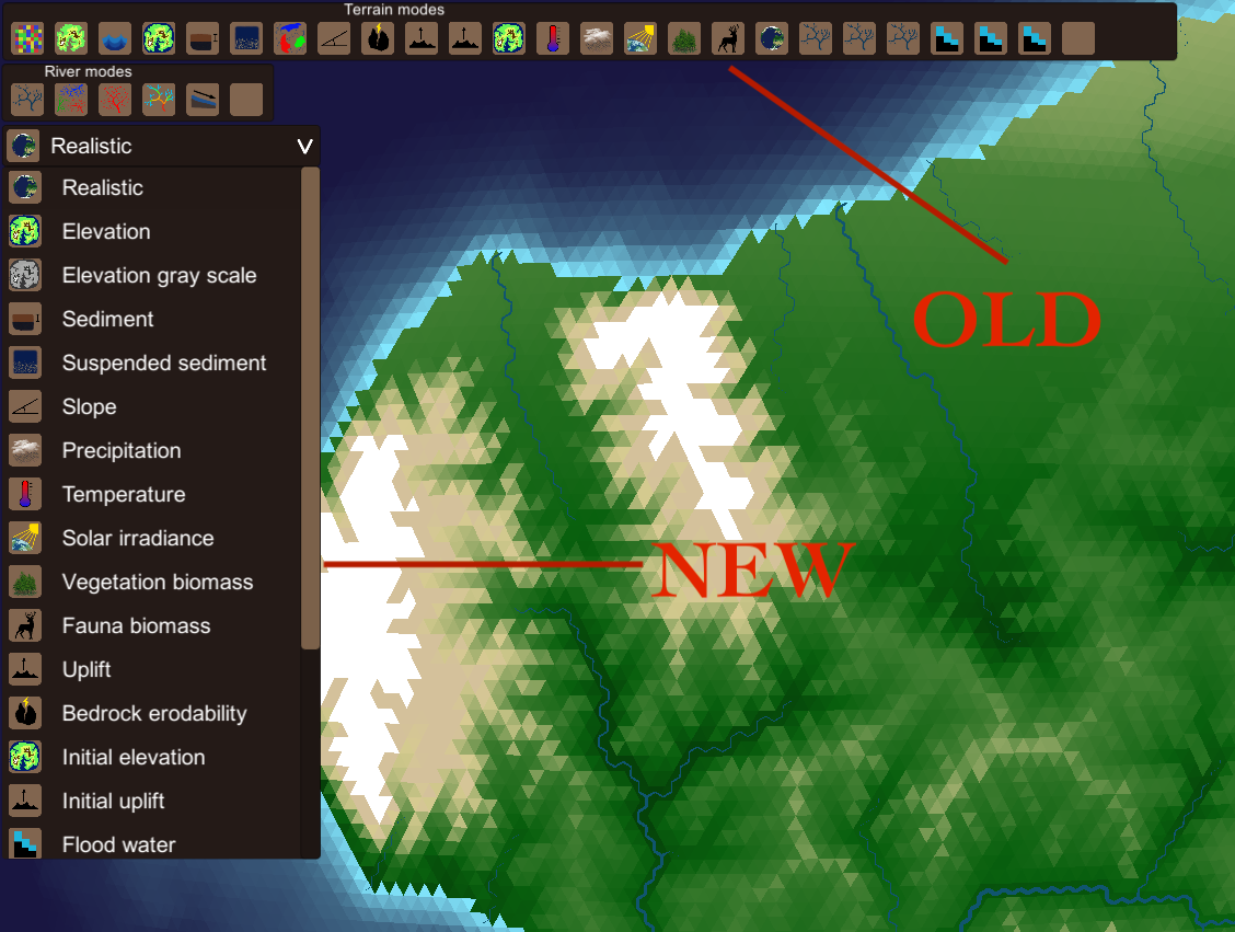
The old system used a list of buttons with icons. These was quick if you knew exactly what every icon represented. The new system has been designed in such a way that it should be much easier for new people to find the desired filters faster. The new system uses a drop down menu. That when open, shows a list of icons paired with a descriptive text. This descriptive text should make it much faster for new people to navigate these filters. Some new filters like "Elevation gray scale" has also been added.
Tile data visualization
The tile is the most important part of the game, it's the atom of the games universe. Every part of the simulation is carried out on tile resolution, and most core gameplay features will exist on a single tile basis. This makes it very important for quick and clean accessibility of tile data.
Previously this was done using a pop up window with a bunch of text. This text was useful, but a bit messy to read. See image below.

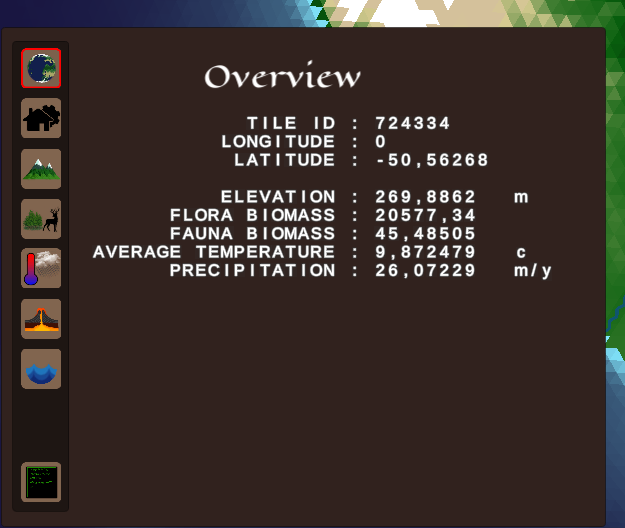
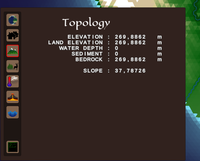
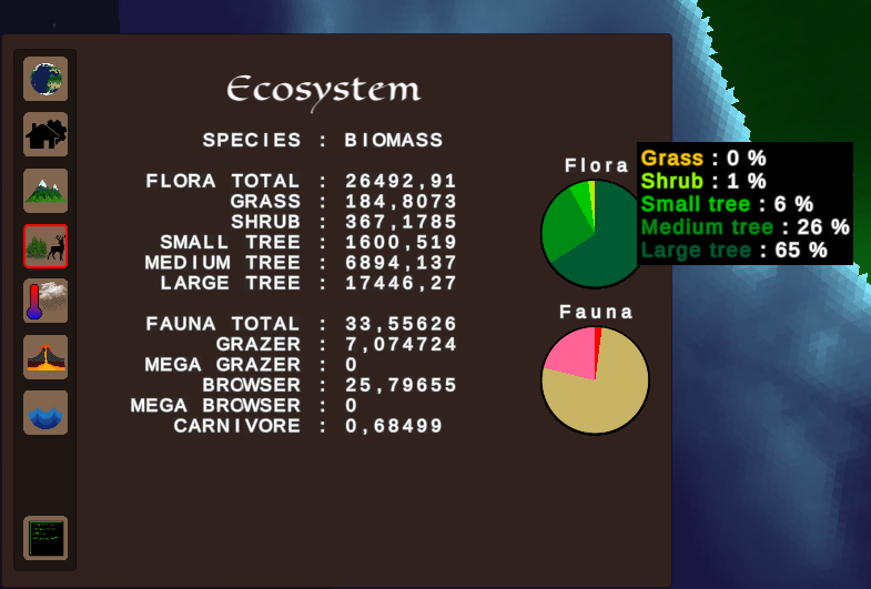
The new implementation uses a tab-page system. Instead of showing one page with all the data, several pages has been created. These pages are structured logically. Everything about ecosystems are on one page, everything about water flow is on another and so on. This makes navigating the data much easier. I've also added some graphical components like pie charts to make it faster to get an overview of the data.
The system as it's implemented now is not complete in any way. But it will make development of the product easier going forward. And people interested in exploring the program will be able to so more easily. Below are some images from the new tab-page system.
To-Do
There are 2 things which I can implement as the next step going forward. It's either realistic plate tectonics. Or it's to start adding some gameplay features, in particular the population and resource production systems. As of writing this I've not decided exactly what to do next. Both options will add to the project in great ways. And both will have to be done eventually. My problem at the moment, is figuring out in what order to do them.
Files
Get Orbis Multiplex
Orbis Multiplex
A complex simulation oriented strategy and management game on planetary scale
| Status | On hold |
| Author | Robin Johansson |
| Genre | Simulation, Educational, Strategy |
| Tags | 4X, Automation, Economy, Generator, Management, Procedural Generation, Singleplayer |
| Languages | English |
More posts
- Generating hexagonal meshes on spheresAug 14, 2022
- Hexagonal grid | 0.2.0.0Aug 07, 2022
- Automatic tick progression | 0.1.6Mar 25, 2022
- Transportation network | 0.1.5Mar 09, 2022
- Ground water diffusion from rivers | 0.1.4Feb 18, 2022
- Updated landscape evolution algorithm | 0.1.3Feb 03, 2022
- Minor industry additions | 0.1.2Jan 28, 2022
- Industry production added to gameplay | 0.1.0Jan 26, 2022
- Version 0.0.11Dec 19, 2021
Comments
Log in with itch.io to leave a comment.
I think the introduction of gameplay will be much more of a contribution than realistic tectonics. In the end, as an outside observer, it would be more interesting for me to look at the game mechanics - and for many, perhaps, too.
Thanks for your reply, your logic is sound. A good approach would probably be to focus every other version on gameplay, and the other on simulation.